What Size Should Email Images Be? Banner, Header, and Logo Dimensions
Every image in an email needs a display size and an export size, and getting either one wrong breaks the display. This article gives you the dimensions for banners, headers, logos, and column images. It also explains where the 600-pixel email width comes from, why the mobile breakpoint is 480 pixels, and why Gmail's clipping limit applies to your HTML rather than your images.
What Is the Standard Email Width?
The standard email body is 600 pixels wide, and this is not an arbitrary choice.
600 pixels is the widest an email can be and still fit inside the reading pane of desktop Outlook without a horizontal scrollbar. The constraint became a convention, and the tools that generate email HTML now use 600 pixels as their default.
If you build wider than 600 pixels, part of your email can be cut off in a preview pane. If you build much narrower, you give up space on desktop without gaining anything on mobile, because mobile layouts expand to fill the screen whatever width you set.
What Is the Best Email Banner Size?
A banner is the wide image at the top of an email, placed below your logo or used instead of one. Use 600 x 200 pixels as the display size, but export the file from wherever you produced it at double this size (1200 x 400).
Regarding banner height, you have some wiggle room, but standard is 200 pixels. Use a shorter banner when you want the reader to reach your text quickly, and a taller one when the image itself carries the message. Above about 300 pixels tall, the banner pushes your first line of copy off the visible area of a phone screen before the reader scrolls.
Some senders build the banner as a band that runs the full width of the screen, wider than the 600-pixel body. A full-width band works, but give the band a background colour that matches the edges of your image. Any client that ignores the full-width instruction falls back to the 600-pixel container and shows your background colour on either side of the image.
What Is the Best Email Header Size?
The header is the top region of your email: your logo, any navigation links, and sometimes a preheader line. A header is 600 pixels wide, and 70 to 200 pixels tall depending on what you put in it. A header holding only a logo is around 70 pixels tall.
The banner is the image inside or below the header. If your email has both a logo bar and a hero image, the logo bar is the header and the hero image is the banner, and together they occupy the top 250 to 350 pixels of the email.
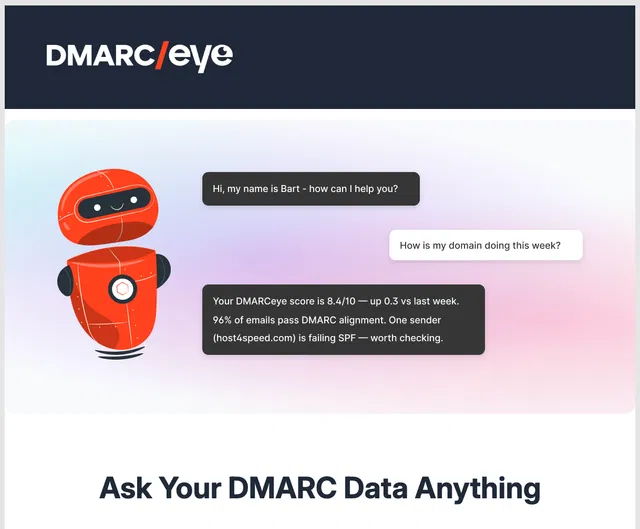
Example of an email with a logo bar and hero banner
Display Size vs. Export Size
Display size is the size at which an email displays an image. Export size is the pixel dimensions of the file you produce and load into the email.
| Element | Display size | Export at | Notes |
|---|---|---|---|
| Email body | 600 px wide | n/a | The container everything else fits inside |
| Full-width banner | 600 x 200 px | 1200 x 400 px | Height is flexible, 150 to 300 px is typical |
| Header, logo only | 600 x 70 px | 1200 x 140 px | Keep the logo itself under 200 px wide |
| Logo | 150 to 200 px wide | 300 to 400 px wide | Height follows the aspect ratio |
| Hero image | 600 px wide | 1200 px wide | Height to suit the crop |
| Two-column image | 280 px wide | 560 px wide | 600 px body, minus padding between columns |
| Three-column image | 180 px wide | 360 px wide | Gets tight, and stacks on mobile anyway |
| Product thumbnail | 200 x 200 px | 400 x 400 px | Square crops survive stacking best |
| Icon | 32 x 32 px | 64 x 64 px | Social and feature icons |
| Button | 200 to 300 px wide | n/a | Build in HTML, not as an image |
| Mobile breakpoint | 480 px | n/a | Below this, columns stack to full width |
The button row and the mobile breakpoint row need more explanation.
Buttons should not be images. A button built as an image disappears when a client blocks images, and your call to action will disappear with it. A bulletproof button is a button assembled from table cells and background colours, so it renders as a clickable, styled block even when the reader has images turned off. Most professional email editors will have pre-made button elements that you can drag and drop in (Topol certainly does).
Button block in Topol's email editor
The mobile breakpoint is 480 pixels, not 600. The breakpoint is the screen width at which your layout switches from side-by-side columns to stacked ones.
Why Should Email Images Be Twice Their Display Size?
A high-resolution screen fits two or more physical pixels into each pixel your layout asks for. If you export an image at exactly 600 pixels wide and display it at 600 pixels, the screen has more pixels available than your file provides, and the image looks soft.
Exporting at double the display size solves the softness. A banner exported at 1200 x 400 and displayed at 600 x 200 is sharp on both standard and high-resolution screens.
Export every image in an email at twice the size it displays at. Exporting at more than double adds file size without a visible gain.
What File Size Should Email Images Be?
Keep each image under 200 KB, and keep all the images in one email under 1 MB combined. No email client enforces the 200 KB and 1 MB limits, but they matter because your reader downloads every image over whatever connection they have at the time, and large files delay the point at which your email looks finished.
- Use JPEG for photographs. Quality around 70 to 80 percent is usually indistinguishable from full quality at a fraction of the file size.
- Use PNG for logos, icons, and anything with flat colour or transparency. PNG keeps edges crisp, where JPEG introduces visible artefacts around text.
- Use GIF only for animation, and expect that some clients will display the first frame and nothing else.
- Keep essential text out of your images. Text inside an image cannot be selected, translated, read aloud by a screen reader, or resized, and it disappears completely when a client blocks images, so don't put anything there that absolutely must be displayed.
Does Image Size Make Gmail Clip Your Email?
No. Gmail clips a message based on the size of its HTML, not the size of its images.
Clipping is Gmail cutting your email off partway through and replacing the rest with a "[Message clipped]" notice and a "View entire message" link. Nothing is deleted, but the reader has to click through to a separate window to see the remainder, and your unsubscribe link and your open-tracking pixel usually sit in the part that gets hidden.
Email clients download image files separately from the message itself, so a 2 MB photograph does not move your message any closer to being clipped. HTML bulk is what moves it closer: inline styles, tracking parameters inside long URLs, repeated table markup, and commented-out code left in the template.
The figure usually given for this limit is 102 KB of HTML. Google has never published it, and its origin cannot be traced. The most thorough public attempt to find the source is an issue in email-bugs, a public catalogue of email client rendering bugs, and the contributors to that issue conclude that none of them can say where the number came from. Several of those contributors report messages clipped below 100 KB, and report the limit being lower in the Gmail mobile apps than on desktop.
Treat 102 KB as a ceiling to stay well below rather than a target to optimise up to. If your message is approaching it, reduce the markup rather than the images. Clients differ in how they handle oversized messages, which is covered in email size limits.
How Wide Should an Email Be on Mobile?
Your email should fill the screen on mobile, and a well-built layout does this for you. Below the 480-pixel breakpoint, the layout stops holding columns side by side and stacks them into a single column that fills the screen width.
What needs adjusting is not the width but every image you sized against that 600-pixel width. A 280-pixel column image looks correct on desktop, where it sits beside the second image in a two-column row. Once the columns stack on a phone, a 280-pixel image sits alone on a screen around 375 pixels wide and leaves visible gaps on both sides. Set your column images to expand to full width when they stack, rather than keeping their desktop dimensions.
Expanding column images by hand means editing the image tag for each one. Drag-and-drop editors, Topol included, stack the columns and expand the images for you when you build the row as a two-column block.
Clickable elements need attention too. A button 200 pixels wide and 30 pixels tall is comfortable to click with a mouse but awkward to hit with a thumb, so give your buttons at least 44 pixels of height on mobile.
How Big Should Email Logos Be?
Keep your logo 150 to 200 pixels wide, export it at 300 to 400 pixels, and let the height follow your aspect ratio.
A logo wider than about 250 pixels starts competing with the content underneath it. The logo's job in an email is recognition rather than impact, and your reader already knows who sent the email, because they read your sender name in their inbox before they opened it.
Use PNG with a transparent background, and check the logo against a dark background as well as a light one. A dark logo on a transparent background disappears when a client inverts the layout, which is one of the more common failures in dark mode email design.
Many email editors, Topol included, have a dark mode preview to help you settle this issue without sending loads of test emails.
What Happens When the Images Do Not Load?
Assume that some of your readers will see none of your images. Several email clients block remote images by default until the reader chooses to load them, so an email that carries its message in pictures arrives as a set of empty rectangles for those readers.
- Give every image descriptive alt text. Alt text is what a client displays in the space where the blocked image would be; if you include it, readers will at least be able to see what the blocked image contains.
- Keep your important words in HTML text, rather than setting them inside the banner image.
- Set a background colour on your image containers, so a blocked image leaves a coloured block rather than a white gap.
Which clients block images, and the reasons they do it, are covered in image blocking.
Do These Dimensions Work in Outlook?
Mostly, though Outlook is where sizing problems appear first. Classic Outlook for Windows renders HTML through Microsoft Word's layout engine rather than a browser engine, and Word's engine ignores several sizing rules that work in every other client.
Classic Outlook does not reliably scale an image down to the display width you specify, so an image exported at 1200 pixels can render at 1200 pixels and break your layout. Set explicit width and height attributes on your image tags rather than relying on CSS alone. Classic Outlook also adds its own spacing around table cells, which is why a design that measures exactly 600 pixels in other clients can measure slightly more there.
Emails designed in Topol render correctly in Outlook, including legacy versions as old as Outlook 2000.
The rest of what Classic Outlook does differently, and the workarounds for each, are covered in why your email looks broken in Outlook.
More Frequently Asked Questions
What Size Should an Email Header Be?
600 pixels wide, and 70 to 200 pixels tall depending on its contents. A header holding only a logo sits near 70 pixels, and one holding a logo, navigation links, and a preheader line runs closer to 200 pixels.
How Big Should Email Images Be in File Size?
Under 200 KB per image, and under 1 MB for all the images in one message combined. Image file size affects how quickly your email finishes rendering for the reader, and it does not affect whether Gmail clips the message, meaning cuts it off partway through and hides the remainder behind a "View entire message" link.
Why Do My Email Images Look Blurry?
Blurry email images were exported at their display size rather than at double it. An image shown at 600 pixels wide needs to be exported at 1200 pixels wide to render sharply on a high-resolution screen.
What Is the Maximum Width for an Email?
No client enforces a maximum, but 600 pixels is the practical one. 600 pixels is the widest that fits comfortably in a desktop reading pane, and it is the default body width in the frameworks that generate email HTML.
Takeaway
Every dimension in an email follows from the 600-pixel body width. Banners match it, columns divide it, and every image exports at double the size it displays at. Two numbers are worth stating plainly: the mobile breakpoint is 480 pixels rather than 600, and Gmail's clipping limit measures your HTML rather than your images.
If you would rather not track these numbers by hand, an email editor that compiles to a tested framework applies the widths, breakpoints, and image scaling for you. Start Your Free Trial of Topol and build from a template that already has the dimensions right.