The Complete Guide to Email Fonts in Topol PRO for Marketing and Design
The fonts you choose for your email affect how readers interpret your message. They determine whether your email appears professional or disorganized. However, here's the challenge: email design isn't the same as web design. You can't just pick any font and expect it to display correctly everywhere. Different email clients, such as Gmail, Outlook, or Apple Mail, handle typography in very different ways. So, knowing which fonts work reliably and how to manage those that don't is what separates emails that look polished from those that seem broken.
Introduction to Email Web-Safe Fonts in Topol PRO
Web-safe fonts are typefaces that are pre-installed on most computers and devices. Since they are already built into the operating system, email clients can display them without needing to download anything new. This makes them the most reliable choice when maintaining consistency across inboxes is your main goal.
Classic web-safe fonts include Arial, Verdana, Georgia, Times New Roman, Trebuchet MS, Courier New, and Tahoma. These may not be the most exciting options, but their reliability is their strength. They render correctly on nearly every inbox and device, whether someone is reading on a laptop in Outlook or scrolling through Gmail on their phone.
By default, Topol PRO offers a list of 15 commonly used fonts: Arial, Bitter, Cabin, Georgia, Helvetica, Lato, Merriweather, Open Sans, PT Sans, PT Serif, Roboto, Ubuntu, Verdana, Poppins, and Oswald. While this is a broad and versatile selection, it’s important to note that not all of these are truly web-safe. Fonts like Arial, Georgia, Helvetica, and Verdana will display consistently across almost all inboxes. Others, such as Lato, Roboto, and Poppins, behave more like custom fonts: they look great in supporting clients but will fall back to alternatives when not supported.
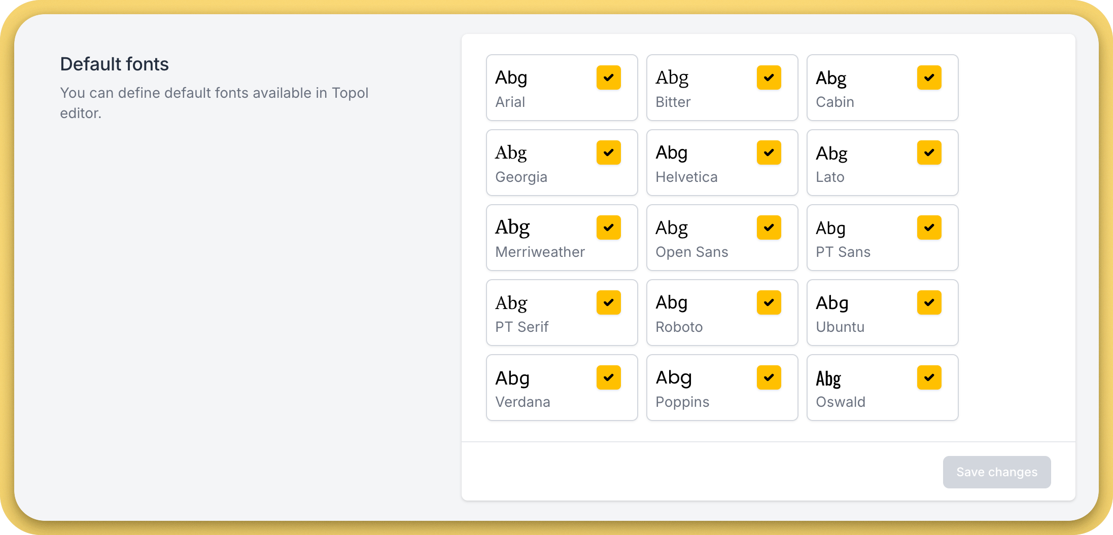
List of fonts available in the Topol PRO editor by default.
This is why it’s important to remember: even if you choose a font from the Topol PRO list, not all of them are universally compatible. When consistency is key, use web-safe fonts. If you want more personality, you can explore modern options, but be aware that they will behave more like custom fonts.
What Fonts to Use in Your Emails
For maximum consistency, stick with the true web-safe fonts, such as Arial, Georgia, or Verdana. These are plain but dependable, ensuring that your message looks professional whether it’s opened in Outlook on Windows or Gmail on an Android phone.
For brands looking for more uniqueness, Topol PRO also lets you upload your own custom fonts. You can do this by providing a font URL, like one from Google Fonts or your own hosted font file. This way, you’re not limited to the editor’s default fonts, and you can match your email typography more closely with your brand’s style.
If you’re aiming to create consistent yet creative brand visuals, you may find useful strategies in the article How Psychology Can Help You Design Better Email Layouts, which explains how visual cues like font weight and spacing shape perception.
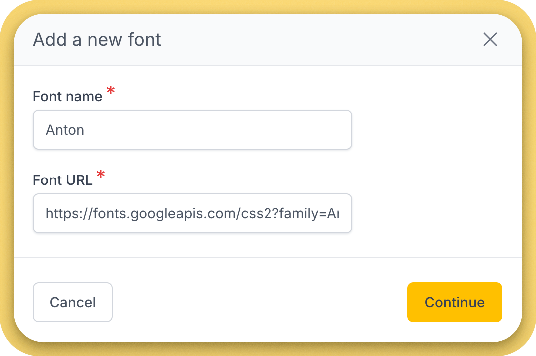
To add a custom font to the editor, just specify a name and a URL where the font is hosted.
Because many email clients don’t support custom fonts, you’ll also need to specify fallback fonts. A fallback font is the backup that appears if your primary choice isn’t available. For example, if you set your font to Roboto but the reader opens your email in Gmail (which doesn’t support it), Gmail will automatically display the fallback option instead.
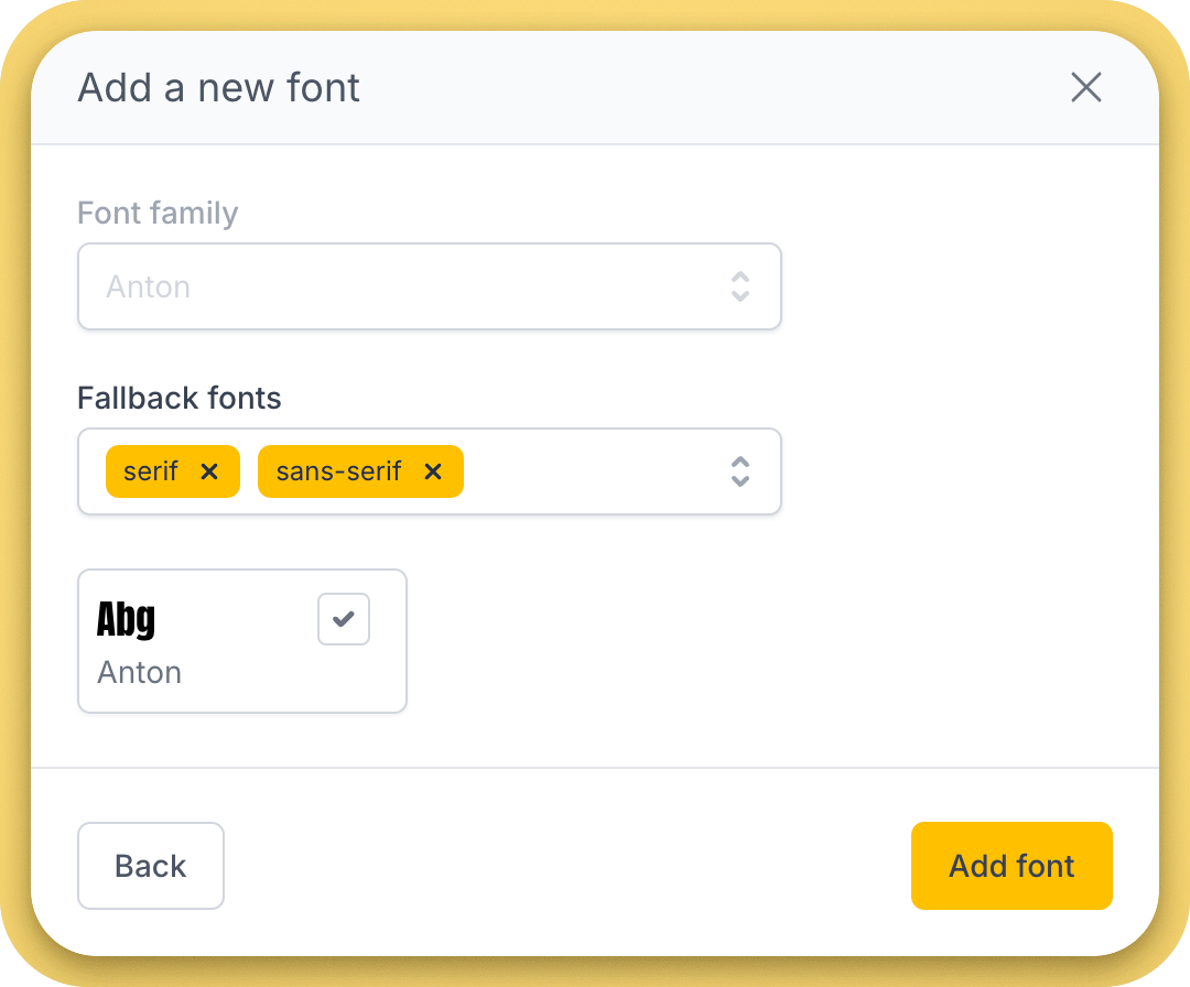
Topol PRO users can set fallback fonts for each custom font.
Fallback fonts are essential because they make sure your email still looks intentional, even if the perfect font isn’t supported. The main goal is to select fallback fonts that resemble your custom font in size and shape so that your layout remains consistent.
For teams managing multiple campaigns, it’s also smart to maintain design consistency across clients and brands — something we covered in the article How Agencies Use Topol Plugin in CRM to Deliver Client Campaigns Faster.
The Current State of Fonts in Email
Email font support today is inconsistent. Some clients handle custom fonts well, while many don’t. Here’s how the major ones behave:
Apple Mail and iOS Mail: The most supportive environment. Both handle embedded web fonts reliably, making Apple devices the safest audience for custom typography.
Gmail (web and app): The strictest client. It strips out all external font imports, so custom fonts never display. Instead, Gmail defaults to system fonts such as Arial or Times New Roman.
Outlook: Highly unpredictable. On Windows, it often ignores font declarations entirely and reverts to Times New Roman. On Mac, support is better but still inconsistent.
Yahoo Mail and AOL Mail: Somewhere in between. Sometimes they respect your chosen fonts, sometimes they discard them, depending on how the email code is written.
This patchwork of support means there’s no single approach that guarantees perfect typography everywhere. For Topol PRO users, it’s especially important to preview and test emails carefully, since what looks perfect in the editor might not display the same way in your subscribers’ inboxes.
Testing designs across clients isn’t limited to fonts. As noted in Why Visual Email Builders Are Replacing Traditional Email Coding, visual builders like Topol make it easier to preview designs and reduce display inconsistencies.
Topol PRO allows you to send a test email to any email client. If you’re uncertain about how your email appears across different email clients, contact our support team. They can provide screenshots of your email from all current email clients using specialized software.
Best Practices for Email Typography
Topol PRO helps you set text properties, but choosing the right options is still your responsibility. Here are the best practices to follow:
Maintain body text at a minimum of 14–16px for readability on small screens. Larger headlines can reach up to 120px with Topol’s editor, but balance them to ensure they don’t overpower the layout.
Stick to one or two fonts per email. Too many different typefaces make designs feel scattered. Instead, create a hierarchy with size, boldness, and spacing, rather than mixing multiple fonts.
Set line spacing carefully. In Topol PRO, you can adjust line height in the text settings. A line height of about 1.4–1.6 times the font size usually balances readability and compactness.
Use color and bold text sparingly. These should emphasize key points, not dominate the design.
Don’t let branding depend entirely on fonts. If your identity depends on a custom typeface, support it with logos, brand colors, or header images. This way, even if the custom font doesn’t display, your brand remains clear.
And if you want to ensure all these elements (fonts, color, spacing) come together harmoniously, check out Email Graphics and UX: Crafting Professional Emails, which explores visual balance and hierarchy in email layouts.
Cheat Sheet: Fonts in Email Design
This cheat sheet outlines the main font categories in Topol PRO and their support levels across email clients. It also offers practical notes for designers, helping them make confident choices that balance creative design with reliability.
| Category | Fonts | Support | Notes for Designers |
|---|---|---|---|
| Web-Safe Fonts | Arial, Georgia, Helvetica, Verdana, Times New Roman, Trebuchet MS, Courier New, Tahoma | Supported in nearly all email clients | Best choice for universal consistency. Safe for body text and headlines. |
| Topol PRO Default Fonts | Arial, Bitter, Cabin, Georgia, Helvetica, Lato, Merriweather, Open Sans, PT Sans, PT Serif, Roboto, Ubuntu, Verdana, Poppins, Oswald | Mixed support | Arial, Georgia, Helvetica, and Verdana are safe. Others behave like custom fonts - fine in Apple Mail/iOS, replaced in Gmail/Outlook. |
| Custom Fonts | Any font you load via URL (e.g., Google Fonts) | Limited support | Apple Mail and iOS Mail show them reliably. Gmail strips them entirely. Outlook for Windows often ignores them. Always add fallbacks. |
| Fallback Fonts | Generic families: sans-serif, serif, monospace | Universal support | Used as the “safety net” if the custom or default font isn’t available. Ensure your fallback font resembles your primary font to maintain design consistency. |
Key Takeaway Points
If you use Topol PRO, you gain access to a versatile font set, precise size control, and the ability to add your own custom fonts. But remember: email typography depends on what inboxes support. Web-safe fonts provide consistency, while custom fonts add style, but only for part of your audience.
The smartest strategy is to use distinctive fonts where possible, back them up with fallbacks, and always test before sending. That way, whether your subscriber opens your email in Apple Mail on an iPhone or in Gmail on a work PC, the design still feels intentional and professional.
To further enhance your typography with effective call-to-actions, explore Professional Email Marketer's Guide to CTA Optimization, which explains how font size and contrast can directly affect conversion rates.