Professional Email Marketer's Guide to CTA Optimization
Most marketers treat CTAs like they're handling nuclear waste – one wrong move and everything explodes. They stick to the "one CTA per email" rule as if it's set in stone. But here's the truth: this outdated approach is hurting your campaign more than you think. This comprehensive guide explains why most email marketers struggle with underperforming CTAs and offers proven strategies to make your email campaigns successful.
A Good CTA Can Make All the Difference
Imagine this: You craft the perfect email, write compelling copy, and hit send to thousands of subscribers. But your click-through rates are stuck at a low 2%. The issue isn't your subject line or your content – it's your CTA strategy.
Choosing the right CTA strategy can be more challenging than it initially appears. How many buttons should you include? Where is the best place to position them? What wording should you use? Keep reading to find answers to these questions, learn what factors to consider when selecting your CTA strategy, and discover how to avoid common mistakes.
The Science Behind Multiple CTAs
The ideal CTA setup includes two buttons, placed strategically in your email:
The main CTA goes above the fold, targeting eager customers ready to take action immediately.
A duplicate CTA appears near the end, catching more hesitant readers after they’ve absorbed your message.
This isn’t about cluttering inboxes—it’s about meeting different readers at different decision points. By placing CTAs at both the top and bottom of your email, you ensure that no one misses the opportunity to act.
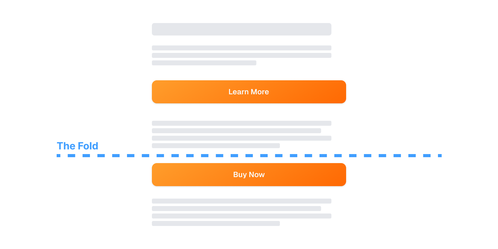
Position of primary and secondary CTAs relative to the screen fold.
It’s important to recognize that your audience isn’t homogenous. Most email subscribers fall into one of three distinct groups:
Those ready to act immediately
Those who need more information or persuasion
Those just browsing or gathering information for later
If your email includes only one CTA, you're essentially speaking to just one of these groups—and ignoring the rest. That’s where commitment levels come into play.
Choosing the Correct Commitment Level
Commitment level describes the amount of effort, decision-making, or risk a user perceives when taking an action. A CTA like “Buy Now” indicates a high-commitment decision: it involves spending money and making a choice. Conversely, “Learn More” or “View Collection” are low-commitment actions—they offer value with minimal pressure, making them more attractive to readers who aren't ready to convert yet.
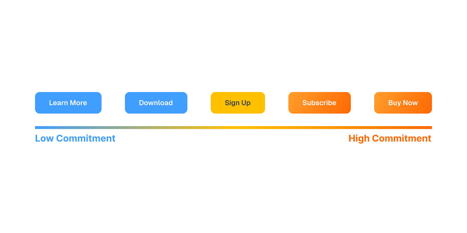
Scale of various CTA button labels based on commitment level.
To speak effectively to all segments of your audience, use secondary CTAs sparingly, ideally integrated as in-text links. These should provide a lower-commitment alternative to your primary CTA. For example, if your main button says “Buy Now,” your secondary CTA might say “Learn More” or “What other products are on sale?”
This approach helps reduce friction, build trust, and encourage hesitant readers to take action—without alienating those who are already ready to click.
The Correct Words That Drive Action
Effective CTAs contain clear action words, like buy, learn, read, discover, or download. But beyond just sounding active, the verb you choose should match the level of commitment you're asking from the reader:
"Download" is low commitment
"Subscribe" is a medium commitment
"Buy" is high commitment
Misalignment between the CTA and the actual task creates cognitive dissonance—that uncomfortable mental tension people feel when something doesn't add up. For example, if you're merely asking for an email address but your button says "Register to Buy Now", the reader may subconsciously feel manipulated. They’re not ready to buy—they’re just considering signing up. This mismatch creates friction, reduces trust, and lowers conversions.
For more about email segments (i.e., specific recipient groups) and how to tailor messaging, see our guide to strategies and best practices of segmentation in email marketing.
Additionally, your CTA should be short and clear, ideally using no more than five words to reduce cognitive load. Every choice a user makes takes mental energy. When someone quickly scans your email, they don’t have the bandwidth to process vague or complicated CTAs like "Explore Our Comprehensive Solution Suite." Such phrasing increases the mental work needed to understand what clicking will do, often leading to indecision or abandonment.
Instead, focus on concise, intuitive CTAs that clearly tell the reader what they’ll get: “Buy Now” consistently outperforms “Purchase” because it’s shorter, simpler, and creates a sense of immediate action. The goal is to eliminate confusion and match expectations—because clarity is the true driver of clicks.
Testing CTAs for Maximum Impact
One of the most overlooked aspects of CTA strategy is regular and rigorous testing. Many marketers limit their testing to subject lines or email visuals—but your call-to-action deserves just as much attention.
This is where A/B testing comes into play. Also called split testing, A/B testing is a way of comparing two versions of a single element—like a CTA button—to see which one performs better. You show Version A to one group of your audience and Version B to another, then analyze which version gets more clicks, conversions, or engagement.
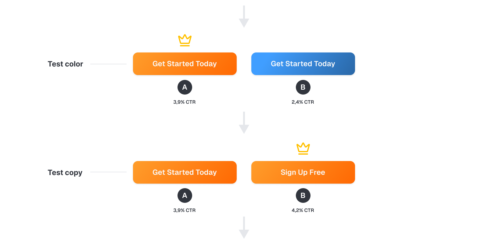
Example of an A/B testing sequence. In the first round, the color of the button is tested. The better-performing version is then subsequently tested for the performance of the copy.
Even subtle differences in wording, placement, color, or button shape can influence how users respond. For example, testing a CTA that says “Get Started Today” versus one that says “Sign Up Free” might seem like a small change, but it can reveal surprising insights about what language resonates best with your audience.
Mobile-First Approach is a Must
In 2025, over half of all email opens will happen on mobile devices. That means your CTA strategy needs to be designed for people checking emails on the go—during commutes, in line at coffee shops, or while multitasking. These readers are scrolling quickly, often with one hand only, and they’re unlikely to scroll back up if they miss your call to action the first time.
This is critical, because emails that aren’t optimized for mobile get deleted fast—studies show that over 50% of recipients will delete poorly formatted emails within seconds.
To adapt, your first CTA should appear within the first few seconds of screen time. That means placing a CTA “above the fold”—the portion of the email that's immediately visible without scrolling. Even better, consider inserting a CTA directly into the preheader, so the recipient doesn’t even need to open the email to see your most important ask.
Why does this matter? On mobile, attention is a scarce resource. Users don’t have the patience to hunt for the CTA halfway through a long scroll. If they don’t see it fast, they won’t click it.
Leveraging Personalization for Powerful CTAs
Personalization in CTAs isn’t just a buzzword—it’s a data-driven strategy for boosting engagement and conversions. In fact, personalized CTAs have been shown to increase click-through rates by up to 42%.
But personalization goes beyond simply dropping someone’s name into a greeting. The real power lies in leveraging subscriber data—things like past behavior, purchase history, location, or browsing patterns—to make each CTA feel relevant and intentional.
Think of it this way: a generic CTA like “Click Here” forces the user to guess what they’ll get. It creates friction. But a personalized CTA like “View Your Recommendations” or “Continue Your Journey” gives immediate context and clarity. It tells the user, “This was made for you.” And when people feel seen, they’re more likely to act.
The Bottom Line
CTAs are not just a design afterthought—they are the moment when attention turns into action. Still, 70% of small businesses omit them entirely. That’s not only a missed click; it’s a missed opportunity.
Even when included, CTAs often fall short by being too generic, too demanding, or poorly placed. Your audience is diverse—some are ready to take action, while others are still exploring. Your strategy should reflect that.
The best marketers don’t guess. They test copy, adjust for commitment levels, personalize by behavior, and design for mobile. They understand that a CTA isn’t just a button—it’s the conversion point.