Minimalist Email Design Guide: How to Create Simple, Effective Campaigns
If you work on email campaigns, consider a typical promotional email filled with banners, lengthy paragraphs, and numerous CTAs that can overwhelm readers. Now, picture the opposite: a simple, clean email with just one eye-catching image, a brief headline, a quick line of copy, and a single button. It's easy to scan, hard to overlook, and simple to act on. That's why minimalism isn't just about looking good. It's a proven way to achieve better results and make your campaigns really stand out.

The Rise of Minimalism in Email Marketing
Minimalism has long shaped web design, apps, and branding. Similar to how Google's clean search page outperforms Yahoo's or Bing's cluttered portals, email marketing is now experiencing its own shift towards simplicity.
The reason is simple: people want quick and clear content. They don't have the patience for long scrolls, cluttered layouts, or too many calls-to-action competing for their attention. This isn't about removing everything; it's about highlighting what matters most. When you eliminate unnecessary elements, your main message becomes impossible to ignore.
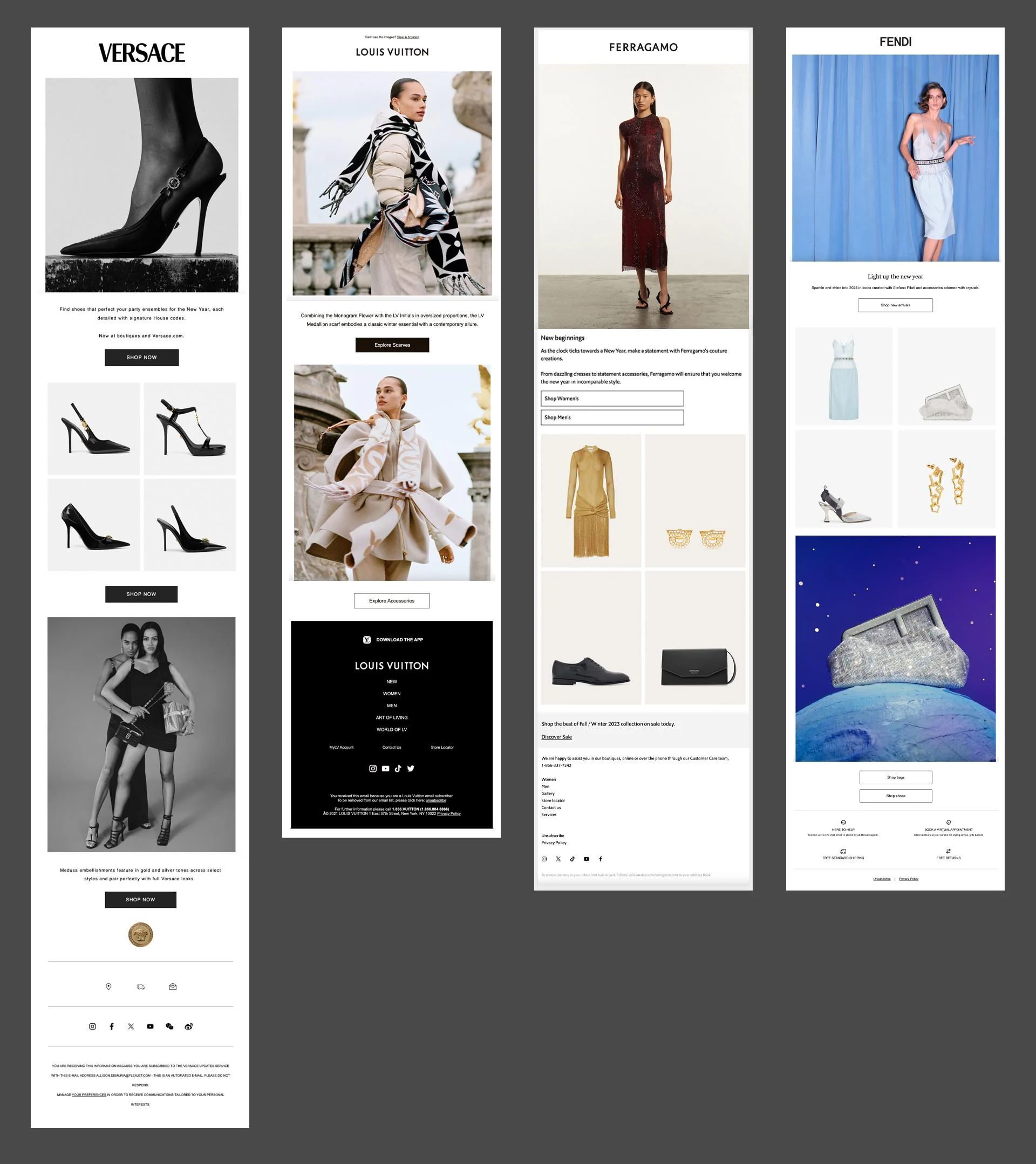
Many luxury fashion brands have already adopted minimalist marketing email designs that let the product speak for itself.
A simple, clean email layout makes your message clearer and more impactful, helping it reach your audience more effectively. Remember that successful emails are the ones that communicate their value instantly, without making readers work to understand the message.
The psychology behind this is straightforward: when people face fewer choices and distractions, they're more likely to make decisions quickly and confidently.
How to Make Your Emails More Minimalist
Marketing experts appreciate minimalist email designs because they make your message clear, attractive, and easy to understand. Your audience quickly receives the message and feels motivated to act. To craft these clean and impactful emails in Topol PRO, here are some top tips to keep in mind.
Use Negative Space Wisely
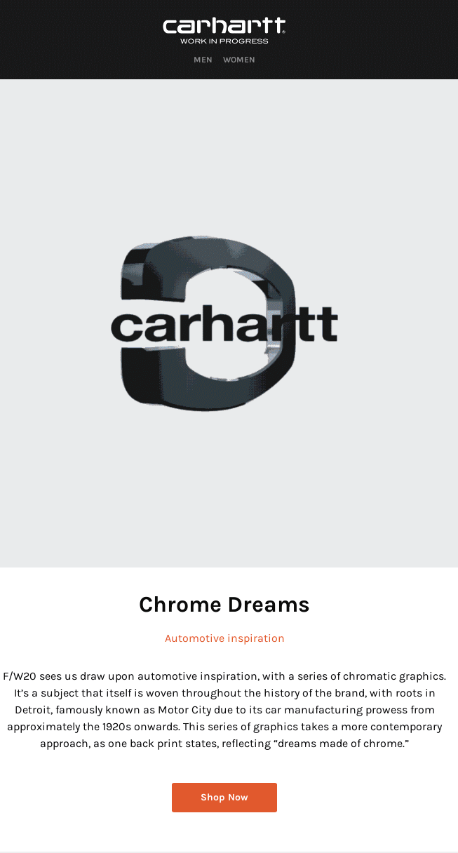
White space (or negative space) is a powerful tool in minimalism. It allows your content to “breathe,” highlighting the most important elements, such as your headline, product image, or call-to-action button. Instead of trying to fill every part of your design, embrace empty space as a feature that improves clarity and focus.
Use Appropriate Colors
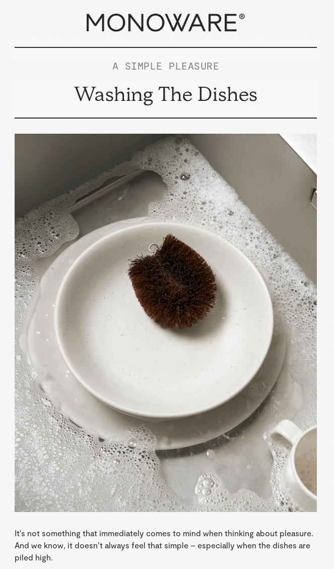
A minimalist design doesn’t mean only black and white. It means using colors intentionally. Stick to a simple palette of two or three colors, preferably your brand colors plus a highlight shade for CTAs. Neutral backgrounds combined with one bold accent color can make your message stand out without feeling overwhelming.
Build Visual Hierarchy
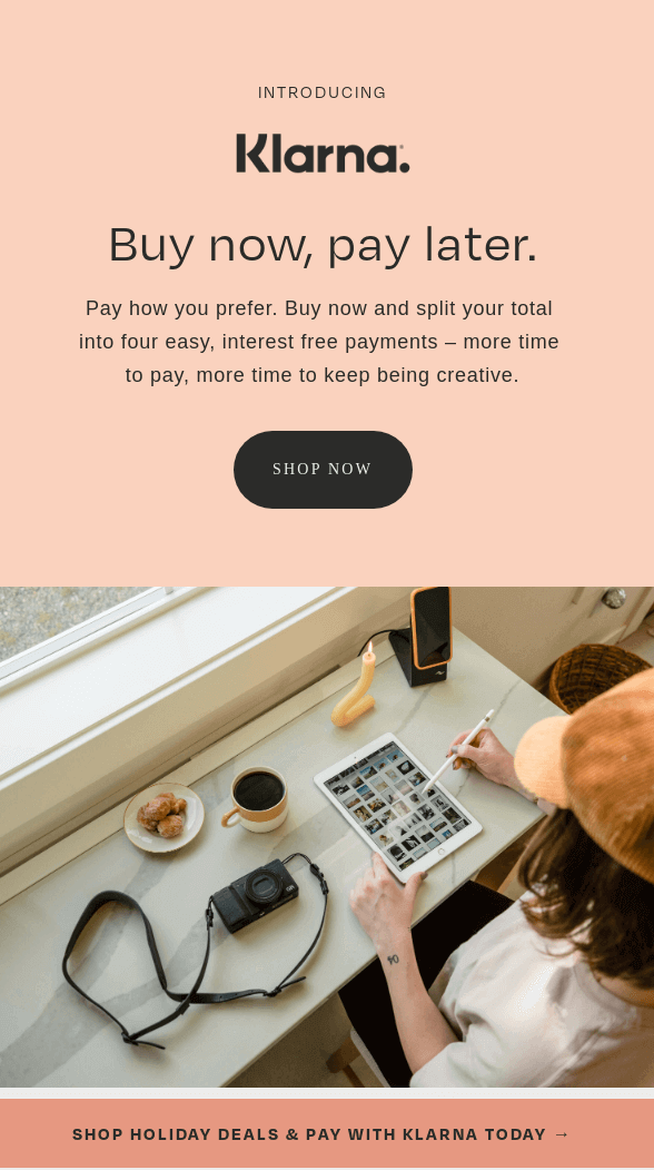
Readers scan first, then read. Guide their eyes from the most important info down. Start with a strong headline, add short supporting text, and close with a clear CTA. Use font size, weight, and spacing wisely to create hierarchy without clutter. This way, your subscribers never have to guess what’s most important.
Limit the Use of Graphics
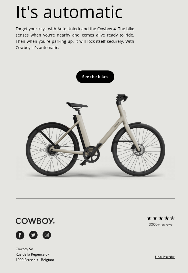
Minimalist design doesn’t mean “no visuals,” but rather “intentional visuals.” Use one strong image or a small set of icons that clearly support your message. Avoid decorative or unnecessary graphics that can distract from your CTA. In minimalist design, every visual should serve a purpose, whether it’s highlighting a product or reinforcing brand identity.
Use Clean Typography
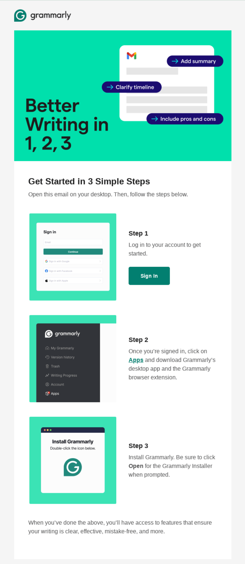
Typography is as much a design choice as images. Stick to one or two fonts (one for headlines and one for body text) and avoid overly decorative styles. Larger font sizes and ample line spacing enhance readability, especially on mobile devices. A clean, modern typeface reinforces the simplicity and clarity you’re aiming for.
Keep It Short!
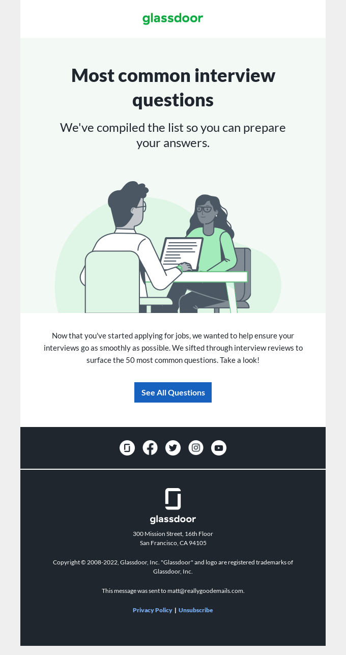
Minimalism also applies to words. Long paragraphs can feel as overwhelming as cluttered layouts. Aim for concise headlines, sharp subtext, and no more than 75–100 words per email. Every sentence should support your main message. If it doesn’t add value, cut it.
Real-World Examples
These methods used by well-known companies demonstrate that when it comes to clarity and clicks, less can often be more.
Warby Parker
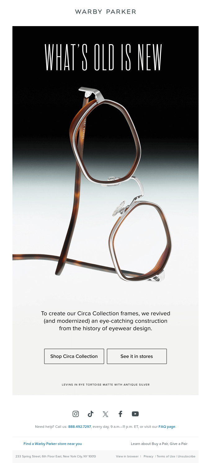
Warby Parker has perfected the art of minimalist email design with their product launch campaigns. No price clutter, no multiple product images, no competing offers. The simple layout keeps all focus on the glasses themselves, allowing the design quality to speak for itself. This approach reflects their core business philosophy: selling premium eyewear by highlighting craftsmanship over flashy marketing. The minimalist design builds trust by conveying confidence in their product.
Headspace
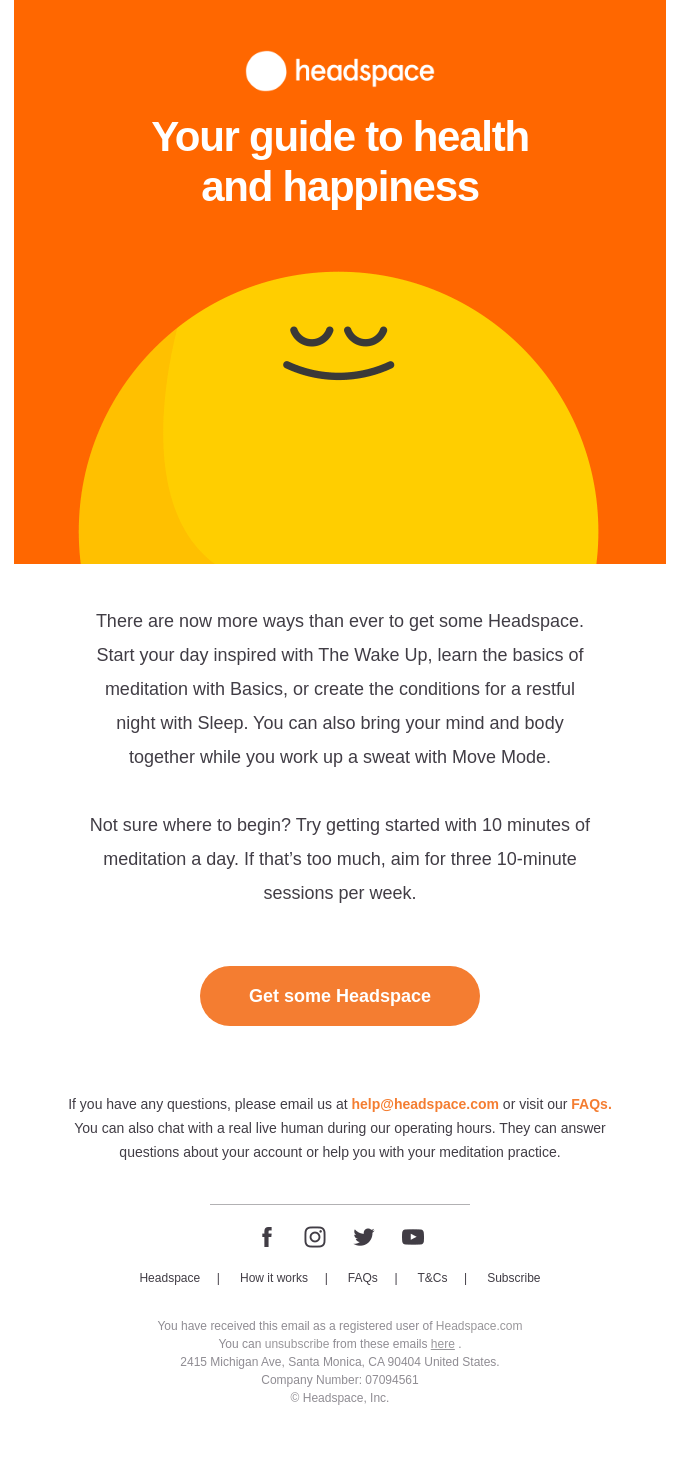
Headspace enhances minimalism through their meditation reminder emails. The entire message feels calm and uncluttered, perfectly matching their brand promise of simplicity and peace of mind. The visual restraint isn't just for appearance; it's intentional. In a world flooded with digital noise, their emails provide the same mental break their app promises. The design becomes a key part of the overall experience.
Apple
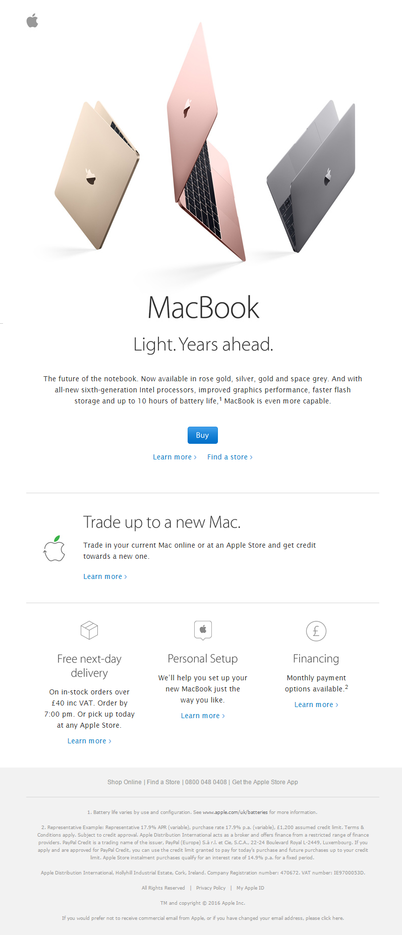
Apple's email design extensively uses white space to emphasize the product. The product is attractively showcased, with pops of color that attract attention. Information is well-organized, featuring a vertical hierarchy that makes it easy to scan. Readers can quickly pick out what's important thanks to varying text sizes and shades of gray. The design stays simple, with minimal elements and a clear layout.
Harry’s
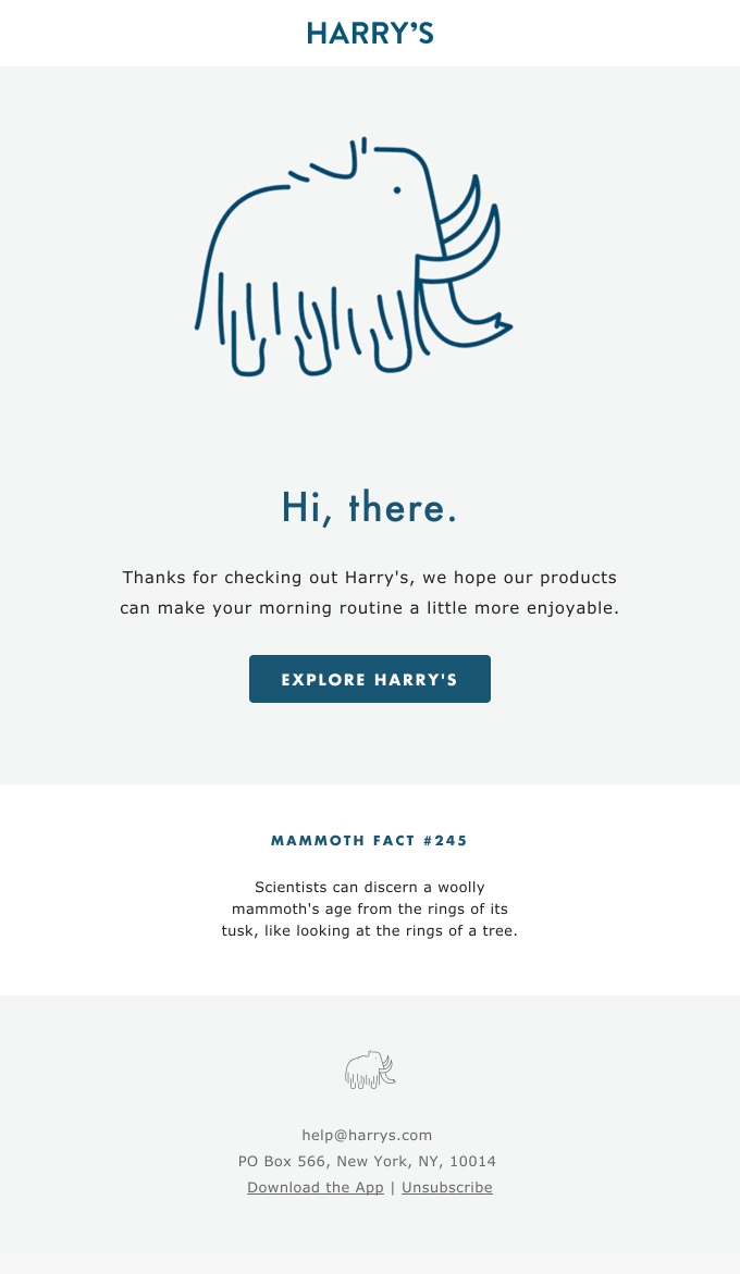
This welcome email from Harry's is minimalist, creative, and just fantastic! They use their favorite mammoth as the main image, keep the text short and sweet, and place the call-to-action (CTA) right where you need it. Plus, they include a cool mammoth fact to add some fun.
Avoiding the Pitfalls of Minimalism
While minimalism can be very effective, it also presents its own challenges. If a design is overly simple, it might lose impact or seem incomplete. Readers may see a plain email as lacking effort, creativity, or value, which can cause them to tune out rather than feel motivated to act.
The key to avoiding this trap is intentionality. Every element you include in a minimalist email must serve a clear purpose, whether it’s guiding the reader’s eye, reinforcing your brand identity, or prompting action. A single powerful image, a well-crafted headline, or a strategically placed CTA can communicate the entire message if executed thoughtfully.
Ask yourself: Does every element in this email support the main goal? If not, remove it.
Another common mistake is relying too much on minimalism in all types of campaigns. For example, a product launch or tutorial might need more detail than just a simple reminder or promotion. If you cut too much, you risk confusing readers who need context to make a decision. Instead of aiming for the bare minimum, focus on clarity and relevance - the two qualities that make minimalism effective without making it feel empty.
Why Topol Is Your Ideal Email Design Partner
Minimalism works best when paired with the right tools. That’s where Topol PRO comes in. Our platform is designed to make building simple, beautiful, and effective emails effortless—even if you’re not a designer.
With Topol PRO, you get:
Free professional email templates – jumpstart your campaigns with a comprehensive library of ready-to-use, mobile-friendly templates created by experts.
Drag-and-Drop Editor - Design eye-catching emails without writing any code.
Custom Branding – Lock in your fonts, colors, and layouts to ensure every email remains consistent with your brand.
Collaboration Features – Share projects, organize templates into folders, and work smoothly as a team.
Direct Integrations – Send your minimalist designs directly to popular platforms like Mailchimp, HubSpot, Brevo, and more.
Closing Thoughts
Minimalism isn't just a passing design trend. It's an effective method to improve the performance of your email campaigns. Keep your messages clear, your layouts simple, and your CTAs compelling. Your subscribers will value the clarity, and your results will show it.
For your next template designed in Topol PRO, try limiting your design to a single message and one CTA. You might discover that less truly delivers more.